|
|
|
|
|
Go back and vote on this image.
|
Picture
Information
|
| URL:
http://riceornot.ricecop.com/?auto=21183 |
|
| Comments: 24 (Read/Post) Favorites: 1 (View) |
Submitted
on: 04-03-2003
|
 View Stats View Stats |
Category:
Off-topic |
|
|
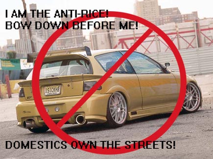
Description:
I am thinking of changing my name on Counter Strike to "The Anti-rice" and using something like this as my logo spray. What do you guys think? Any suggestions on things I might change? This includes the picture of the car and the text. |
Showing page: 1 of 2
[ 1 2 ]
 |
| #2 |
4-03-2003 @ 02:55:48 PM |
| Posted By : ambientFLIER |
Reply | Edit | Del |
none at all
[Edited by ambientFLIER on 4-03-2003 @ 02:56:10 PM]
|
|
| #4 |
4-03-2003 @ 02:59:57 PM |
| Posted By : Biohazard |
Reply | Edit | Del |
#2, This invokes no thought or emotion from you whatsoever?
|
|
| #6 |
4-03-2003 @ 03:01:02 PM |
| Posted By : Biohazard |
Reply | Edit | Del |
#3, thank you. Anything I should change? I still have it open in photoshop.
|
|
| #9 |
4-03-2003 @ 03:03:21 PM |
| Posted By : mr_mcmunkee |
Reply | Edit | Del |
DOUBLE POST!? How'd that happen.
No, it works well the way it is. That Civic in the picture is hideous and 100% rice.
(Maybe add a small American flag in the bottom-right corner?)
|
|
| #13 |
4-03-2003 @ 03:08:27 PM |
| Posted By : mr_mcmunkee |
Reply | Edit | Del |
Nah, it makes his anti-rice propoganda more convincing. Besides, that Jap car in the photo SUCKS!!!!!!!!!
|
|
| #15 |
4-03-2003 @ 03:11:43 PM |
| Posted By : mr_mcmunkee |
Reply | Edit | Del |
#14, Inspired by the Japanese. (Kanji, Kamikaze body kits, altezzas...etc)
|
|
| #16 |
4-03-2003 @ 03:14:22 PM |
| Posted By : Biohazard |
Reply | Edit | Del |
The flag works well at this size, but when shrunk down to the size I will need to use it at, it just looks like a smudge.
|
Showing page: 1 of 2
[ 1 2 ]
Login to leave a comment
|
|
|
|
|