Go to car


Latest Comments
Car: 20705   By: ricerocketboy   Comment: "DJ KHALED!..."
Car: 97661   By: Skid   Comment: "They're not the worst, but there are quite a few w..."
Car: 97661   By: DiRF   Comment: "They're like polished, oversized versions of what ..."
Car: 97661   By: ricerocketboy   Comment: "those wheels are awful, especially on here...."
Car: 33317   By: ricerocketboy   Comment: "Before the Ineos Grenadier, there was this. I reme..."
See last 25 comments
 Go to

Next picture
Ricecop Home
Linkage
Plates
Bling Bling
Photo
Free Post

 Top 10

Top 10 Ricers
Top 10 Non-Ricers
Top 10 Other Good
Top 10 Other Bad

 New & Retired

Newest Images
Retired Images

 Other

Submit a picture
Profile Lookup
FAQ
Site Log
Leader Board
Site Stats

 Online Now

1 Ricecops
1 Guests

Detailed List

 Login

Username:

Password:


Remember Login?

Sign up!
Why sign up?
Forgot my password


View this image at full size
Click here to let us know if the image above is broken.


Go back and vote on this image.

Picture Information
URL: http://riceornot.ricecop.com/?auto=95783
Submitted by: ricerocketboy
Comments: 6  (Read/Post)     Favorites: 0  (View)
Submitted on: 11-11-2016
View Stats Category: Car
Photoshops of this image:
95791,
Description:
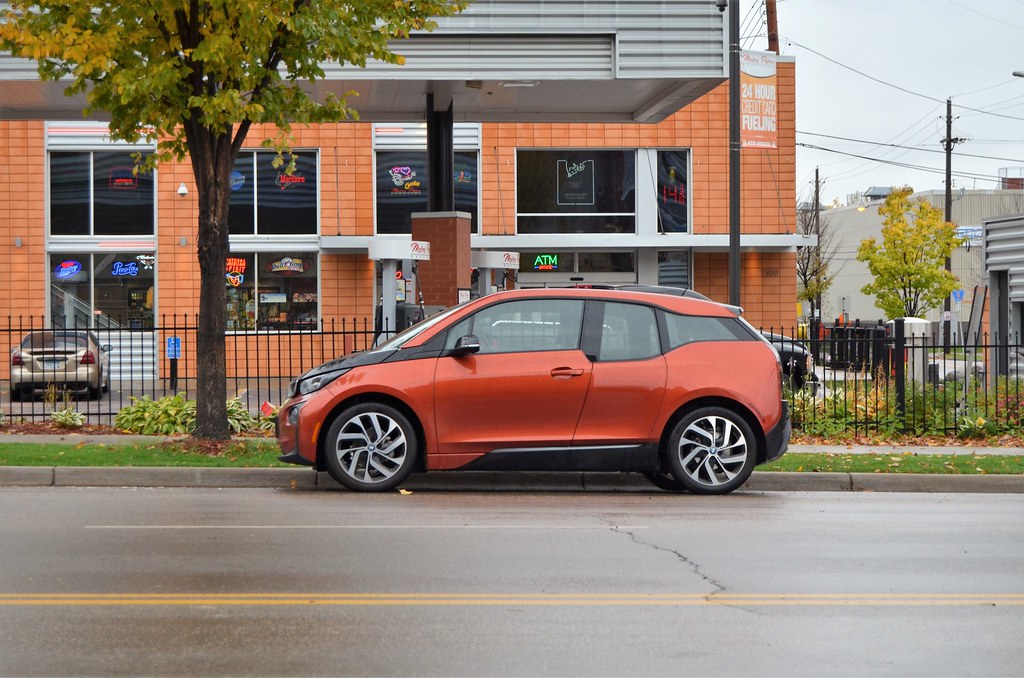
BMW i3


   Comments

Showing page: 1 of 1
[
1 ]

#1
11-11-2016 @ 12:10:05 PM
Posted By : DiRF  Reply | Edit | Del
I still don't know what the hell they were trying to accomplish with this design. Were they simply going for "different" at the cost of everything else?

#2
11-11-2016 @ 02:20:42 PM
Posted By : Adambomb Reply | Edit | Del
Still don't understand why people buy these fugly things.

#3
11-11-2016 @ 07:07:58 PM
Posted By : ricerocketboy Reply | Edit | Del
#2, tax rebates and easy access to the "i" brand, which allows them to get services not offered with traditional BMWs.

#4
11-11-2016 @ 10:01:45 PM
Posted By : Low-Tech Redneck Reply | Edit | Del
#2, They had to settle now that Nissan pulled the plug on the Cube?

#5
11-11-2016 @ 11:05:11 PM
Posted By : DiRF  Reply | Edit | Del
#4, I like the Cube... it at least had an overall plan for its design, even if it was asymmetrical... this is just entirely incongruent...

#6
11-12-2016 @ 01:30:36 AM
Posted By : Low-Tech Redneck Reply | Edit | Del
#5, I get the distinct feeling it's asymmetry bugged me more than the average person... possibly undiagnosed autism, who knows?

Agreed though that this thing is a mess.

"


Showing page: 1 of 1
[
1 ]


Login to leave a comment

Classifieds 
Click here to post your own classified ad


Want to send some feedback? Click here.

Server time: Friday, November 22, 2024 09:49:25 PM

All pictures on this site are property of their respective owners.
Copyright © 2000 - 2024 Ricecop. All rights reserved.